
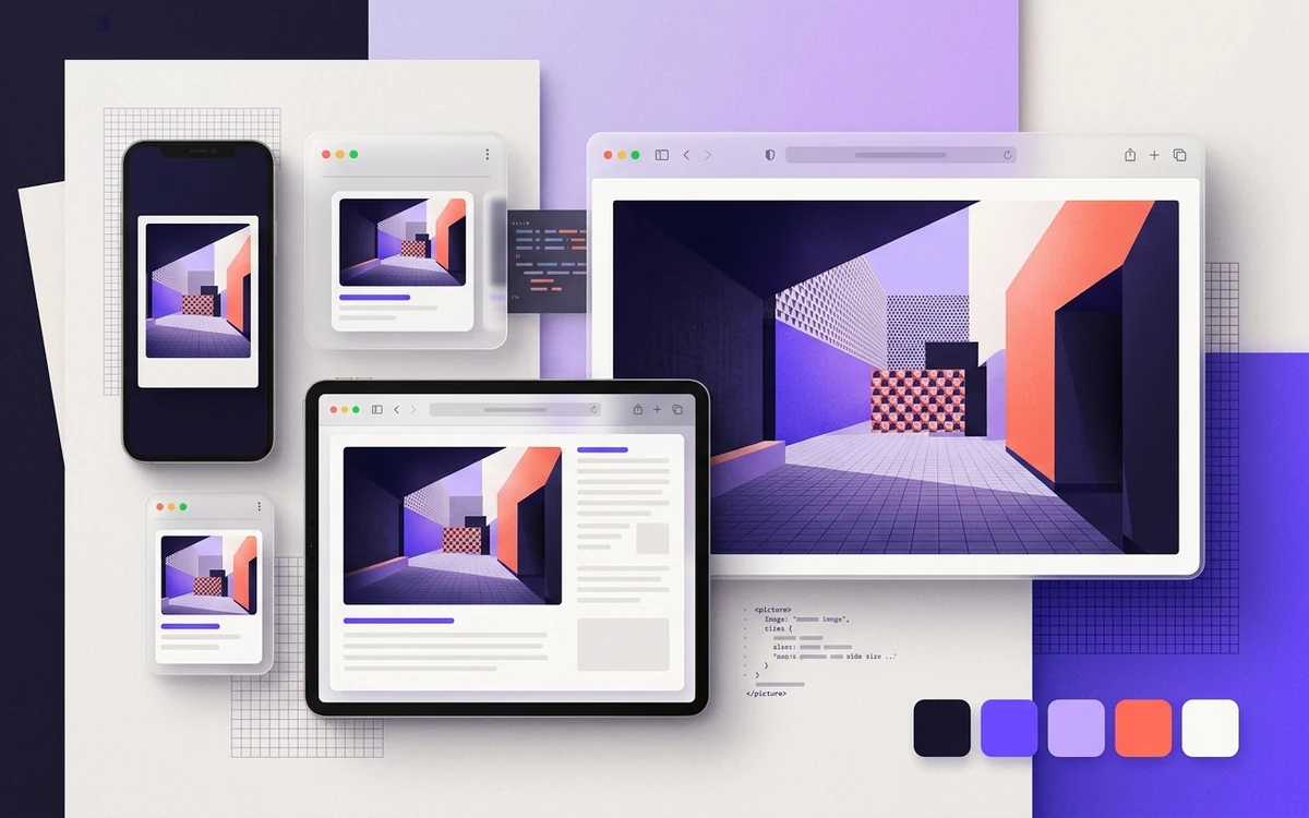
Responsive images let the browser download a smaller file on a phone and a sharper one on a big or high-density screen: srcset lists the files you have, sizes tells the browser how wide the image will display, and <picture> lets you swap in a different crop or file format. Get those three right and you stop shipping 2,000-pixel photos to 390-pixel phones.
What problem do srcset and sizes solve?
A plain <img src="hero.jpg"> sends the same file to every device. Pick a big file and phones waste data. Pick a small one and it looks soft on a 27-inch monitor or a phone with a high device pixel ratio (DPR, the number of physical pixels per CSS pixel; most modern phones are 2 or 3).
The browser also can't wait for your CSS to work out how big the image will be. Its preload scanner starts fetching images while the HTML is still arriving, before layout exists. So you have to tell it the likely display width up front. That's the whole job of sizes.
What's the difference between w and x descriptors?
Each entry in srcset is a URL followed by a descriptor. There are two kinds, and you can't mix them in the same srcset.
| Descriptor | Example | Needs sizes? | Best for |
|---|---|---|---|
Width (w) | photo-800.jpg 800w | Yes | Content images, heroes, cards, anything fluid |
Density (x) | [email protected] 2x | No | Fixed-size images: logos, icons, avatars |
Width descriptors
The w number is the file's real pixel width. You're telling the browser, "this file is 800 pixels wide," and letting it do the math.
<img
  src="photo-800.jpg"
  srcset="photo-400.jpg 400w,
          photo-800.jpg 800w,
          photo-1200.jpg 1200w,
          photo-1600.jpg 1600w"
  sizes="(max-width: 700px) 100vw, 700px"
  width="1600" height="900"
  alt="Harbor at sunrise with fishing boats">
Say the image shows at 390 CSS pixels on a phone with a DPR of 3. The browser needs about 1,170 real pixels, so it'll likely grab photo-1200.jpg. On a desktop where the column is 700px at DPR 1, photo-800.jpg is plenty.
Density descriptors
If the image is always the same CSS size, skip the math and list densities:
<img
  src="logo-160.png"
  srcset="logo-160.png 1x, logo-320.png 2x"
  width="160" height="40"
  alt="Acme Tools">
No sizes needed. A 2x screen gets the 320-pixel file. Our post on retina and HiDPI images goes deeper on when 3x is worth it (usually it isn't).
How does the sizes attribute work?
sizes is a comma-separated list of media conditions, each paired with a width. The browser uses the first condition that matches. The last item has no condition and acts as the default.
sizes="(max-width: 600px) 100vw,
       (max-width: 1100px) 50vw,
       33vw"
That reads as: full width on small screens, half width on mid screens, a third of the viewport otherwise.
Units you can use
vwfor images that scale with the viewport.pxoremfor images capped by a max-width container.calc()when padding or gutters eat into the width, likecalc(100vw - 32px).
Percentages aren't allowed. The browser doesn't know what they'd be a percentage of, since there's no layout yet.
A realistic example
Picture a blog layout: full-bleed on phones with 16px gutters, a 720px max-width article column on larger screens.
<img
  src="post-960.jpg"
  srcset="post-480.jpg 480w,
          post-720.jpg 720w,
          post-960.jpg 960w,
          post-1440.jpg 1440w"
  sizes="(max-width: 752px) calc(100vw - 32px), 720px"
  width="1440" height="810"
  alt="Screenshot of the image settings panel">
The 752px breakpoint is just 720 plus the two 16px gutters. When your sizes mirrors your CSS like this, the browser's guess lines up with reality.
Does the browser always pick the image I expect?
No, and that's by design. The WHATWG HTML spec says the browser picks a source "in an implementation-defined manner." In practice it looks at the slot width from sizes, the DPR, and the zoom level. It may also reuse a larger file that's already cached instead of fetching a smaller one.
So don't panic if DevTools shows photo-1600.jpg on a small window. Resize the window down after a big file loaded, and Chrome often keeps the big one. Test in a fresh private window at the size you care about. Check currentSrc in the console to see which file actually won.
When should you use the picture element?
Reach for <picture> in two cases. For everything else, <img srcset> is simpler and gives the browser more freedom.
Art direction: a different crop per screen
A wide hero can turn into a tiny strip on a phone. With media on <source>, you can serve a tighter, taller crop instead. Unlike sizes, the media attribute is a command, not a hint. The browser must use the first matching source.
<picture>
  <source
    media="(max-width: 600px)"
    srcset="team-square-600.jpg 600w, team-square-1000.jpg 1000w"
    sizes="100vw"
    width="1000" height="1000">
  <img
    src="team-wide-1200.jpg"
    srcset="team-wide-1200.jpg 1200w, team-wide-2000.jpg 2000w"
    sizes="(max-width: 1200px) 100vw, 1200px"
    width="2000" height="900"
    alt="Our support team in the Denver office">
</picture>
Note the width and height on the <source>. Modern browsers use them to reserve the right space for each crop. See how width and height stop layout shift for why that matters.
Format switching: AVIF or WebP with a fallback
The type attribute lets the browser skip formats it can't decode:
<picture>
  <source type="image/avif"
    srcset="card-400.avif 400w, card-800.avif 800w"
    sizes="(max-width: 600px) 100vw, 400px">
  <source type="image/webp"
    srcset="card-400.webp 400w, card-800.webp 800w"
    sizes="(max-width: 600px) 100vw, 400px">
  <img src="card-800.jpg"
    srcset="card-400.jpg 400w, card-800.jpg 800w"
    sizes="(max-width: 600px) 100vw, 400px"
    width="800" height="500"
    alt="Pricing card for the Pro plan">
</picture>
Order matters: the browser takes the first <source> it supports, so put the smallest format first. The <img> is required. It's the fallback, and it's where alt, width, height, and loading live. Not sure which formats are worth it? Our WebP vs AVIF vs JPEG vs PNG comparison covers that.
How many image widths should you generate?
There's no magic list. Aim to cover the real display sizes on your site without big jumps between them. A few practical rules:
- Find your image's smallest and largest display width in CSS pixels. Check your layout at phone, tablet, and desktop sizes.
- Multiply the largest by 2 for high-density screens. That's roughly your top file size. Going past 2x rarely pays off for photos.
- Fill the gap with steps of about 300 to 500 pixels. For a content image, 400, 800, 1200, and 1600 is a common, sane set.
- Stop adding sizes when the files between steps differ by only a few KB. Past that point you're just filling your CDN cache.
Four to six candidates covers most images. Two is usually too few, since the browser ends up downloading a file much bigger than the slot. Fifteen is too many. It barely saves bytes and hurts your cache hit rate, because each visitor might pull a slightly different file. Pair this with sensible compression quality settings and you'll often save more than any extra breakpoint would.
What does sizes="auto" do?
Writing sizes by hand means describing your layout twice, once in CSS and once in HTML. sizes="auto" fixes that for lazy-loaded images. Because a lazy image loads after layout is done, the browser can just measure the element and pick from srcset.
<img
  loading="lazy"
  sizes="auto, (max-width: 600px) 100vw, 400px"
  srcset="card-400.jpg 400w, card-800.jpg 800w, card-1200.jpg 1200w"
  src="card-800.jpg"
  width="1200" height="750"
  alt="Chart of monthly traffic">
Two rules. It's only valid with loading="lazy". And support is still uneven. Chrome and Edge support it, and Firefox added it in version 150 (April 2026). Safari doesn't support it as of this writing. In Safari, auto alone is treated as invalid and you fall back to the 100vw default. That's why the example lists normal sizes after auto. Browsers that don't understand auto use those instead.
Also, the element needs a real size before the image loads. Give it width and height attributes or CSS dimensions, or the browser may measure zero and pick the smallest file.
Common mistakes
- Using
wdescriptors withoutsizes. The browser assumes100vw. A 300px sidebar thumbnail then downloads the file meant for a full-width screen. It's probably the most common srcset bug out there. sizesthat don't match your CSS. You redesign the grid from two columns to three and forget to updatesizes. Now every card downloads 50% more than it needs. Put a comment next to your CSS breakpoints as a reminder.- Setting
sizestoo small. The opposite problem. The image looks blurry on some screens because the browser trusted you. - Using
<picture>withmediajust to resize. That forces a specific file and takes away the browser's ability to account for DPR and cache. Usesrcsetandsizeson<img>instead. - Mismatched
wvalues. Labeling a 1000px file as800wthrows off the math. Generate the numbers from your build tool, not by hand. - Lazy-loading the hero. Responsive markup won't save a hero image that's lazy-loaded. See lazy loading without hurting LCP.
Does this apply to favicons and social images?
Not really. Favicons are chosen through <link rel="icon"> with its own sizes attribute, which lists pixel dimensions like 32x32 and means something different. Our favicon sizes guide covers that. Social previews are a single fixed file picked by the platform's crawler, so srcset does nothing there. See our Open Graph image size guide instead.
How do you check that it's working?
- Open a private window and set the viewport to a phone width in DevTools device mode.
- Reload with the Network panel filtered to Img. Note which file loaded and its transfer size.
- In the console, select the image and run
$0.currentSrcto confirm the chosen candidate. - Compare the file's pixel width to the rendered width times DPR. If the file is more than about 1.5 times what's needed, your
sizesis probably off. - Repeat at tablet and desktop widths. Lighthouse's "Properly size images" audit will flag the worst offenders too.
Favicons are the exception to all of this. There's no srcset for icons. Instead you ship a small set of fixed sizes and declare each one in the head. The favicon generator builds that set from one image.
TL;DR
Use srcset with w descriptors and an accurate sizes for fluid images, and x descriptors for fixed-size ones. Use <picture> only for different crops or formats. Keep four to six candidates, make sizes match your CSS, and treat sizes="auto" as a lazy-image bonus with a fallback until Safari supports it.