
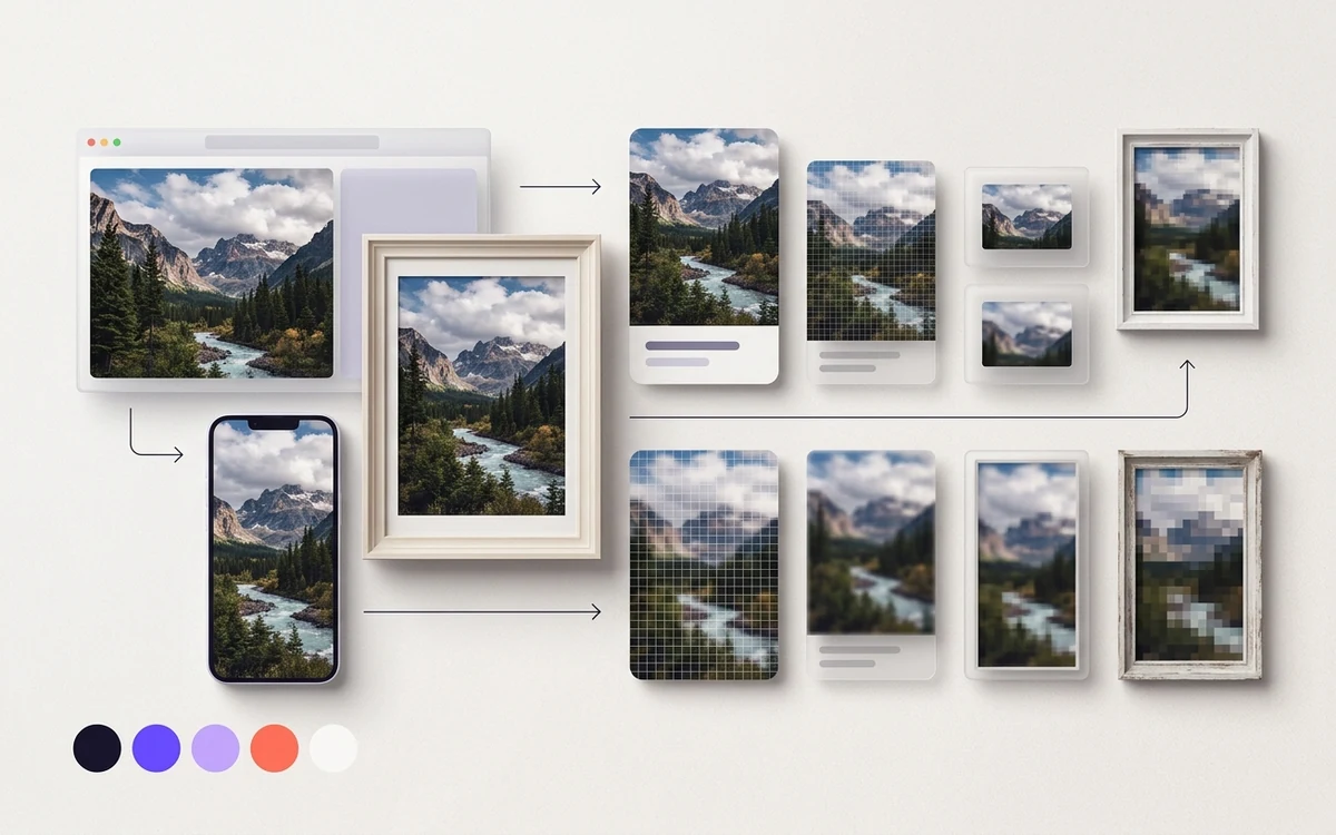
A good starting point is quality 75–82 for JPEG (with mozjpeg) and WebP, and roughly 45–65 for AVIF, then adjust by looking at the result. Those numbers aren't rules, because every encoder uses its own quality scale. Resizing the image to the size it's actually shown at will save you far more bytes than any quality tweak.
What's the difference between lossy and lossless compression?
Lossy compression throws away detail you're unlikely to notice. You can't get it back. JPEG, lossy WebP, and lossy AVIF work this way, and they're what you want for photos.
Lossless compression packs the data tighter but decodes to the exact same pixels. PNG, lossless WebP, and lossless AVIF work this way. It's the right call for screenshots, UI images, and anything with small text. For photos, lossless files are usually several times larger than a good lossy version that looks the same.
If you're still choosing a format, start with our WebP vs AVIF vs JPEG vs PNG comparison. This post is about what to do once you've picked one.
Why isn't quality 80 the same in every tool?
Because "quality" is just a knob each encoder maps to its own internal settings. There's no shared scale.
You can see it in the defaults. The popular Node library sharp defaults to quality 80 for JPEG, 80 for WebP, and 50 for AVIF. Google's cwebp defaults to 75. Those tools aren't aiming for wildly different results. The scales just mean different things.
Even two JPEG encoders can disagree. mozjpeg at 75 and a basic libjpeg build at 75 won't produce the same file. mozjpeg adds tricks like trellis quantization, which usually gets you a smaller file at similar visual quality.
So don't copy a number from one tool into another. Pick a starting point for the tool you're actually using, then test.
What quality setting should you start with?
These are starting points, not answers. They're typical ranges that work for many web photos. Your images, your audience, and your tolerance for artifacts may push you higher or lower.
| Format and encoder | Starting range | Tool default | Notes |
|---|---|---|---|
| JPEG (mozjpeg) | 75–82 | sharp: 80 | Go higher for images with fine text or gradients. |
| WebP (lossy, cwebp or sharp) | 72–82 | cwebp: 75, sharp: 80 | Try -sharp_yuv if colored edges look soft. |
| AVIF (libavif or sharp, 0–100 scale) | 45–65 | sharp: 50 | Smooth areas can look waxy if you push too low. |
| PNG | Lossless | n/a | Optimize with oxipng; use pngquant only if a palette is OK. |
web.dev makes a useful point about JPEG: across most of the quality scale, the differences are hard to see even side by side. That's why dropping from 95 to 80 often saves a lot of bytes for almost no visible change. Below a certain point, though, things fall apart fast. Blocky skies and halos around edges are the usual first signs.
How do you test quality by eye?
- Pick 5–10 real images from your site. Include a face, a sky or gradient, and something with fine detail like hair or fabric.
- Resize each to its real display size first (see below).
- Encode at your starting quality. Then encode again 10 points lower and 10 points higher.
- Compare at 100% zoom, on the kind of screen your readers use. Look at faces, skies, and edges.
- Pick the lowest setting where you can't see a problem without hunting for it.
- Use that setting as your batch default, and spot-check new image types when they show up.
Squoosh is handy for this. It shows a split-screen before and after, with the output size, right in the browser.
Why should you resize before you compress?
Because pixel count drives file size more than anything else. A photo that's twice as wide and twice as tall has four times the pixels. No quality setting claws that back.
Phone cameras routinely produce images 4000 pixels wide or more. If your content column is 800 CSS pixels, you need about 1600 pixels for 2x screens, and less for everyone else. DPR, or device pixel ratio, is how many physical pixels a screen uses per CSS pixel. Our retina and HiDPI images guide explains how far to go. Past 2x, most people can't tell.
Then generate a few widths and let the browser pick with srcset. The responsive images srcset and sizes guide covers the markup.
What is chroma subsampling, and should you use it?
Chroma subsampling stores color at lower resolution than brightness. Your eye is much more sensitive to brightness detail, so on photos you rarely notice. The common mode, 4:2:0, keeps color at half the width and half the height. That's a real byte saving.
The catch is sharp color edges. Red text on white, thin colored lines in charts, and saturated logos can look fuzzy or bleed. When that happens, switch to 4:4:4, which keeps full color resolution.
- JPEG: sharp defaults to 4:2:0. In mozjpeg's
cjpeg, use-sample 1x1for 4:4:4. In ImageMagick,-sampling-factor 4:4:4. - Lossy WebP: always 4:2:0. The
-sharp_yuvoption in cwebp gives a sharper, slower conversion that helps colored edges. - AVIF: sharp defaults to 4:4:4. With
avifenc, the-yoption picks 444, 422, or 420.
Rule of thumb: photos get 4:2:0, graphics with colored text get 4:4:4 or a lossless format.
How big should each image be?
There's no official limit. These are rules of thumb we use for byte budgets, assuming the image is already resized and in a modern format. Treat them as alarms, not targets.
- Hero or LCP image: aim for roughly 100–200 KB at the largest size you serve. LCP, or Largest Contentful Paint, is the time until the biggest visible element renders. The hero is often that element.
- In-article photo: roughly 50–120 KB.
- Card thumbnail: roughly 10–30 KB.
- Logo or icon: SVG, usually a few KB. For favicons specifically, see the favicon image optimization guide.
If a hero is 600 KB, don't start by lowering quality. Check its pixel dimensions first. It's almost always too big. Then read about lazy loading without hurting LCP, because a heavy hero that's also lazy-loaded is a double hit.
Which tools should you use, and what are the commands?
For one-off images, use Squoosh in the browser. For anything repeatable, script it. A few examples:
sharp (Node.js)
import sharp from 'sharp';

await sharp('photo.jpg')
  .rotate()                       // apply EXIF orientation
  .resize({ width: 1600, withoutEnlargement: true })
  .avif({ quality: 55 })
  .toFile('photo-1600.avif');
Swap .avif() for .webp({ quality: 78 }) or .jpeg({ quality: 78, mozjpeg: true }). Note that sharp strips metadata by default, including the orientation tag. That's why .rotate() comes first.
libvips
vipsthumbnail photo.jpg --size 1600x -o photo-1600.webp[Q=78]libvips is the engine under sharp. It's very fast and light on memory, which matters for big batches.
ImageMagick
magick photo.jpg -auto-orient -resize "1600x>" -quality 80 \
  -sampling-factor 4:2:0 -strip photo-1600.jpg
The > means "only shrink, never enlarge." -strip removes metadata. Our post on stripping EXIF but keeping credits explains when you'd want to keep some of it.
cwebp
cwebp -q 78 -m 6 -resize 1600 0 photo.png -o photo-1600.webp-m 6 is the slowest, most thorough method. The default is 4. A 0 for height keeps the aspect ratio.
avifenc
avifenc -q 55 -s 6 photo.png photo.avif-q runs 0–100, where 100 is lossless. -s is speed, 0 (slowest) to 10 (fastest), default 6. avifenc keeps metadata unless you pass --ignore-exif and --ignore-xmp. Resize with another tool first.
How do you optimize PNG files?
Two steps, and they do different things.
- Lossless first.
oxipng -o 4 --strip safe image.pngtries better compression settings and drops unneeded chunks. The pixels don't change. - Lossy if it fits.
pngquant --quality=65-85 --skip-if-larger --output small.png image.pngconverts to a 256-color palette. On flat graphics and many screenshots it looks the same and shrinks the file a lot. On photos or smooth gradients, you'll see banding.
Run oxipng after pngquant, too. It can squeeze the palette file a bit more.
Common mistakes
- Compressing before resizing. You end up tuning quality on pixels nobody sees.
- Re-compressing JPEGs over and over. Each lossy save adds damage. Keep originals and always export from them.
- Copying quality numbers between tools. AVIF 80 in sharp is a much heavier file than most sites need.
- Judging on a zoomed-out thumbnail. Look at 100% size, on a real device.
- One setting for everything. Screenshots with text need more care than outdoor scenery photos.
- Losing orientation. Stripping metadata without applying rotation first can leave phone photos sideways.
Tiny icons follow different rules. At 16 or 32 pixels, lossy artifacts show up fast, so favicons are usually saved as PNG or ICO. The favicon converter turns one source image into those sizes for you.
TL;DR
Resize images to their real display size first, then start around 75–82 for mozjpeg JPEG and WebP, and around 45–65 for AVIF. Compare the output by eye and keep the lowest setting that looks clean. Use 4:4:4 color or lossless for text-heavy graphics, and run PNGs through oxipng.