
Favicon Contrast Checker
Upload a favicon and measure its visibility against light and dark browser chrome with native-size previews and transparent-edge diagnostics.
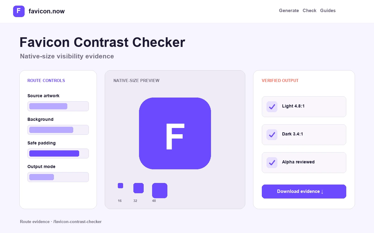
Measure visibility at the size and backgrounds users actually see
A large artwork preview can conceal pale edges, low-contrast silhouettes, and transparency that disappears into browser chrome. This checker renders the actual small icon and reports pixel-level luminance against both backgrounds.
Decode the real uploaded pixels
The checker draws the selected image to a controlled canvas and analyzes visible pixels rather than trusting the extension. Transparent areas are separated from the mark so empty canvas does not inflate the apparent contrast result.
Compare two hostile contexts
Representative light and dark chrome expose opposite failures: white edges disappear on pale interfaces, black marks disappear in dark or private windows, and semitransparent antialiasing can create halos on either one.
Judge native-size recognition
The numeric result supports—not replaces—the 16- and 32-pixel preview. A busy multicolor image can contain high-contrast pixels while its overall silhouette remains impossible to recognize in a crowded tab bar.
How to interpret the contrast report
A result around 3:1 is used here as a practical graphical target. It is not a favicon standard, a WCAG conformance claim, or proof that people recognize the brand. Treat a failed light or dark result as a prompt to add a self-contained field, outline the silhouette, increase optical weight, or choose a different small-size reduction.
Transparency findings identify how much of the square is empty and whether visible edge pixels are partially transparent. A transparent browser icon can be correct, but its mark should not depend on the page background because browser chrome is outside the page’s control. Apple and maskable assets should be assessed as separate compositions.
Worked acceptance test
- Upload the exact candidate that will be deployed, not only the large logo master.
- Compare the light and dark results at 16 and 32 pixels without browser zoom.
- Check whether the outer silhouette remains distinct from adjacent tab icons.
- Correct pale edges, dark edges, or excessive empty space in the source composition.
- Export the revised package and use the live checker to confirm the same file reached production.
The report analyzes representative interface colors and decoded pixels. Actual browser themes, inactive-tab treatments, color profiles, display density, user contrast settings, and neighboring icons vary, so important releases still need a short manual review on supported clients.
Favicon contrast questions
Does passing 3:1 make a favicon accessible?+
No. Contrast is one useful signal. Recognition, redundant meaning, motion, native-size geometry, and equivalent in-page status communication still matter.
Why does a transparent icon pass one background and fail the other?+
The mark probably relies on a light or dark surrounding field. Add an outline, use a self-contained background, or create a composition whose silhouette separates from both.
Should status be shown only in the favicon?+
No. Mirror meaningful state in the document title and page interface so it remains available when the favicon is hidden, cached, or not perceivable.
From favicon idea to verified deployment
Follow one clear path through creation, inspection, installation, and troubleshooting.