
Text to Favicon Generator
Create a letter or initials favicon with optical centering, font-weight controls, tiny-size previews, and a complete SVG, ICO, PNG, Apple, and PWA package.
This is how a clear favicon helps your result feel recognizable.
Build a monogram that remains readable at sixteen pixels
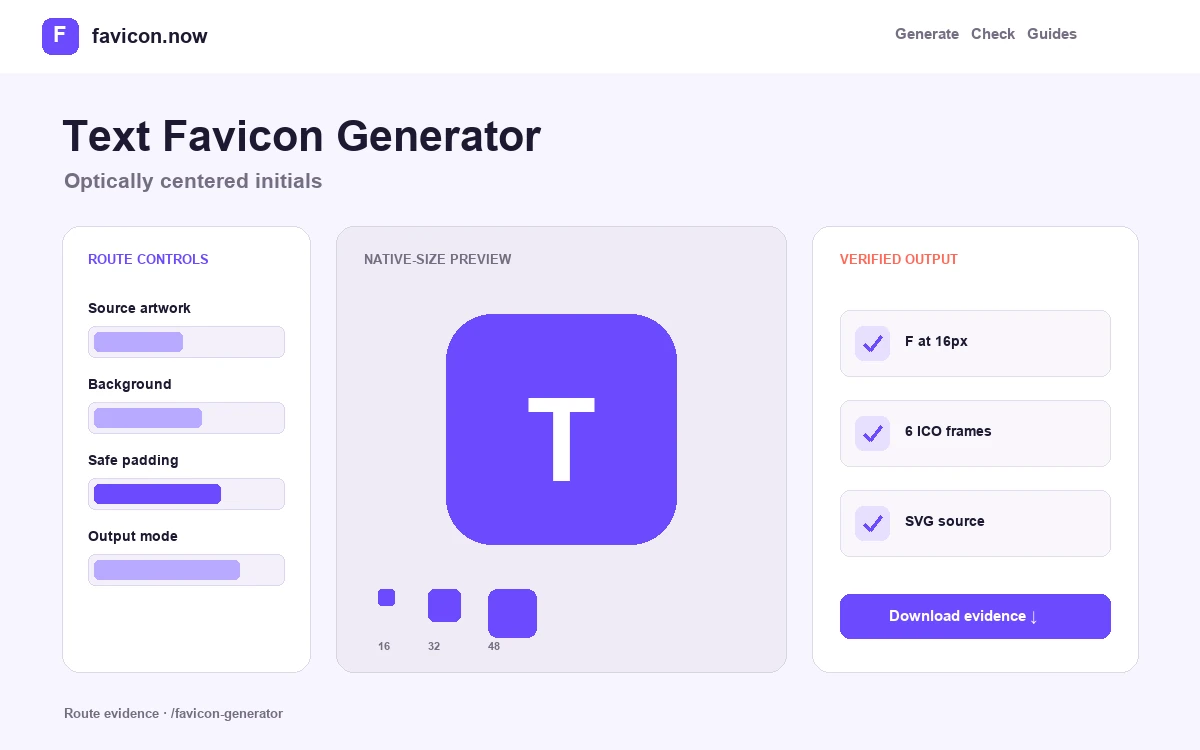
A text favicon is a miniature lettering problem, not a normal typography layout. Use one distinctive letter or, at most, two compact initials. The editor renders the mark at native tab sizes so you can judge counters, spacing, and edge clearance before exporting it.
The package turns the composed result into consistent browser, Apple, and installable-app assets. The generated SVG keeps the simple letter treatment scalable, while the ICO and PNG files preserve the exact colors, weight, padding, and shape you approved.
Choose characters by silhouette
Uppercase initials usually survive reduction better than a word or thin lowercase pair. Compare the outside shape and enclosed counters at 16×16; recognizable geometry matters more than typographic detail.
Correct optical centering
A mathematically centered letter can still look low, high, or off-axis. Adjust weight and padding while watching the native-size preview, especially for round letters and diagonals such as A, V, and W.
Export one controlled identity
The same rendered square feeds the ICO frames, PNG fallbacks, touch icon, and app icons. That prevents small but visible color and alignment differences between independently exported files.
Export one candidate with a single uppercase character and another with the intended initials. Compare counter openness, baseline position, and edge clearance in the 16-pixel tab rendering. Record the chosen font family, numeric weight, foreground, background, canvas shape, and padding beside the approved package. That design record makes the result reproducible if a later browser or font change alters the editor preview.
Ship a monogram without changing its typography
A text favicon is reproducible only when the approved characters, typeface, weight, colors, padding, and canvas shape travel together. The exported files freeze that decision so production does not depend on a visitor having the same font installed.
Record the lettering recipe
Save the exact characters, font family, numeric weight, foreground and background colors, and padding percentage. Keep this short design record beside the ZIP so a future re-export does not drift.
Compare the embedded small frames
Open favicon.ico and inspect its 16×16 and 32×32 frames. Closed counters, a low-looking baseline, or uneven side space should send the design back to the editor before deployment.
Install one canonical set
Copy the approved SVG, ICO, PNG, Apple, and manifest files to stable public paths. Add the supplied head markup once in the shared layout, then verify a nested page as well as the homepage.
If two initials become cramped, keep one distinctive letter for the favicon and use the full name in the page title and visible brand mark.
See a measured wordmark reduction →Text favicon FAQ
How many letters should a favicon contain?+
One letter is the safest default. Two initials can work when their combined silhouette remains clear at 16×16; three usually become cramped.
Which font weight works best?+
Start around 700–800, then inspect the smallest preview. Heavy strokes close small counters, while light strokes can disappear on low-density screens.
Can I use a transparent background?+
Yes, but test the letter against both light and dark browser chrome. A self-contained colored field is more predictable when the mark itself has only one color.
From favicon idea to verified deployment
Follow one clear path through creation, inspection, installation, and troubleshooting.