
Logo to Favicon Generator
Convert a logo into a favicon set with safe padding, tiny-size previews, SVG and ICO output, Apple touch icons, and maskable PWA assets.
This is how a clear favicon helps your result feel recognizable.
Turn the recognizable part of your logo into the icon
Full wordmarks usually collapse in a browser tab. Upload the symbol, monogram, or strongest silhouette from the brand system, then judge it at 16 pixels before accepting the large preview.
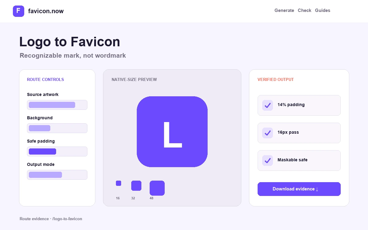
Keep roughly 10–15% open space around the essential mark. Maskable previews need an even safer central composition because Android and other install surfaces may crop the same source into different shapes.
Select the brand cue, not the whole lockup
Horizontal wordmarks and taglines collapse in a browser tab. Upload the standalone symbol, a monogram, or the most recognizable geometric feature and treat the favicon as an approved reduction within the identity system.
Define optical padding for small and adaptive crops
Begin around 10–15% open space, then compare the native-size and maskable previews. Round forms may tolerate less padding than sharp corners; important details must remain inside the adaptive safe area.
Document differences from the primary logo
A favicon can use heavier strokes, fewer internal details, and a self-contained background while remaining on-brand. Record those changes so a later redesign does not replace the readable reduction with the full wordmark again.
Wide logo reduced to one monogram
16px recognition · 14% safe padding · light/dark contrast
A documented icon variant across browser, Apple, and PWA surfaces
Logo to Favicon Generator output matrix
favicon.svgSimplified brand markScalable tab iconfavicon.icoSmall-size fallbacksCompatibilitymaskable-icon-512x512.pngProtected compositionAdaptive app cropsDocument the favicon as an intentional logo reduction
The best production favicon often differs from the primary lockup. It may use one initial, heavier strokes, fewer internal details, and more open space while retaining the brand’s recognizable color and silhouette.
Name the retained brand cue
Record whether the favicon uses a symbol, monogram, color relationship, or geometric fragment. This makes the simplification defensible inside the wider identity system.
Approve optical spacing
Compare roughly 10–15% padding with the actual 16-pixel result. Round and diagonal forms need visual centering, while maskable output needs essential details farther from the edge.
Handoff every surface
Package the transparent or scalable browser mark separately from full-background Apple and maskable compositions when one file cannot satisfy every crop.
If the brand name becomes a row of unreadable pixels, use the symbol or strongest initial and let the page title carry the full name.
Follow the wordmark reduction case study →Logo to Favicon Generator FAQ
Should I upload my full logo?+
Use the symbol or initials unless the complete lockup remains readable at 16×16.
Can the favicon differ from the logo?+
Yes. Optical weight, spacing, and background treatment often need a documented small-size variant.
How much padding should a logo favicon have?+
Ten to fifteen percent is a useful start; the native and maskable previews should decide the final value.
From favicon idea to verified deployment
Follow one clear path through creation, inspection, installation, and troubleshooting.