
Quick answer
Choose one brand signal: a letterform, distinctive silhouette, or reduced symbol. Multiple symbols become visual noise in a browser tab.
- Last verified
- July 31, 2026
- Evidence
- Primary documentation plus transparent editorial analysis
- Primary sources
- 1
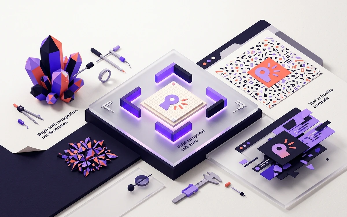
Begin with recognition, not decoration
Choose one brand signal: a letterform, distinctive silhouette, or reduced symbol. Multiple symbols become visual noise in a browser tab.
Use filled forms and open negative space. Thin outlines can vanish after rasterization, while tiny enclosed gaps can fill in.
Connected next stepAnimated Favicons: Useful Status Signal or Gimmick? for the closest prerequisite or comparison.
Build an optical safe zone
Leave roughly 10–15% breathing room around the core mark. Circle masks and rounded app-icon crops can remove corners, so keep essential content near the center.
Connected next stepColor Profiles in Favicon Files: Why They Matter for the next connected implementation decision.
Test in hostile contexts
Preview against white, charcoal, and browser-chrome gray. Then view 16, 32, 48, and 180 pixels without zooming. The smallest preview is the design review, not a footnote.
Connected next stepOpen the most relevant production tool and verify the decision with a working output.
Review the headings, sources, implementation artifact, and update record for this guide as structured JSON.
Download guide evidence ↓- Guide
- How to Design a Favicon That Survives 16×16
- Coverage
- Client behavior can change by browser, operating system, platform version, cache state and deployment configuration. Unperformed manual observations are not claimed.
Questions, answered
How many colors should a favicon use?+
One foreground and one background color is a strong starting point; add complexity only when it remains readable.
Can I use my full logo?+
Use the logo mark or initials. Full wordmarks are rarely legible in a tab.