
Favicon Design and Accessibility Guides
Practical visual systems for an asset that often renders at only sixteen pixels.
Use this favicon guide cluster in production order
Favicon design is reduction design. The useful question is not whether the master artwork looks polished at 512 pixels, but whether its silhouette, spacing, contrast, and meaning survive browser-tab size, adaptive crops, light and dark chrome, and neighboring site icons.
Use the design guide for the core process, the contrast and accessibility references for measurable checks, and the case studies for controlled examples. Animation and theme adaptation are optional techniques, not substitutes for a strong static mark.
Simplify the identity
Prefer one symbol, monogram, or distinctive shape over a wordmark. Remove details that close or flicker after rasterization.
Protect recognition
Keep deliberate edge space, preserve important geometry inside adaptive safe areas, and test contrast on representative light and dark interface colors.
Use redundant meaning
Do not encode status through color or favicon animation alone. Match changes with document-title and in-page signals that remain understandable and accessible.
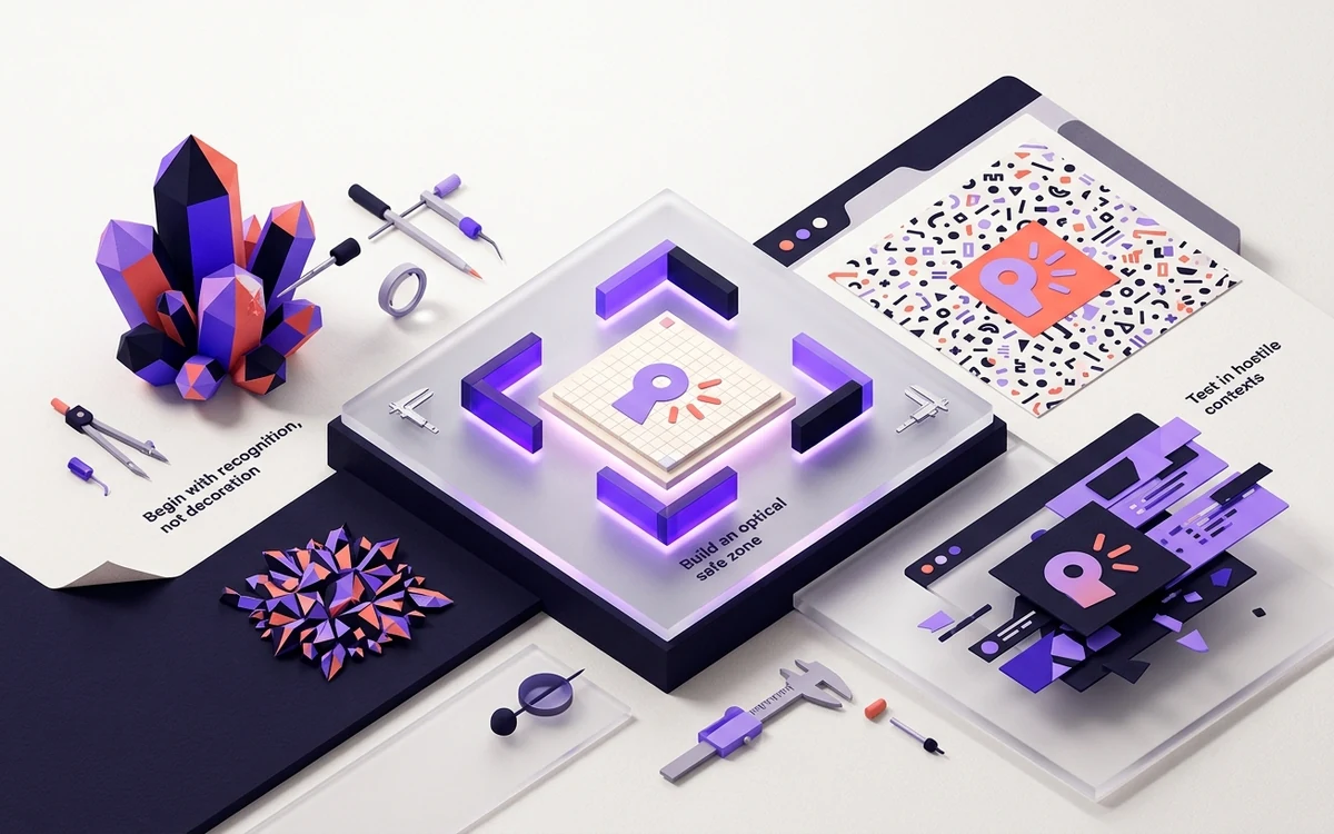
Start with: How to Design a Favicon That Survives 16×16
A field guide to silhouettes, optical weight, spacing, contrast, and ruthless simplification.
Use this foundational guide first, then choose the route below that matches your file format, platform, failure symptom, design constraint, or implementation layer.
Begin with this guide →How to Design a Favicon That Survives 16×16
A field guide to silhouettes, optical weight, spacing, contrast, and ruthless simplification.
Dark Mode Favicons Without Invisible Logos
Use SVG media queries or a contrast-safe universal mark, then keep raster fallbacks predictable.
Accessible Favicon Design: Contrast, Motion, and Meaning
Favicons are decorative interface assets, but inclusive design still improves recognition for everyone.
Animated Favicons: Useful Status Signal or Gimmick?
Animation can communicate progress or alerts, but browser support, performance, and accessibility make it a specialist technique.
Case Study: Turning a Wordmark Into a 16px Favicon
A transparent design teardown showing why a full horizontal logo fails in a tab and how to select a stronger monogram without losing identity.
Case Study: A Transparent Mark Inside a Maskable Icon
A reproducible package test showing why transparent browser artwork needs a separate full-bleed maskable composition for adaptive app shapes.
Favicon Design Guides questions
Use these answers to choose the correct guide or tool before changing production files.
How much favicon padding should I use?+
Ten to fifteen percent is a useful starting range, but optical balance and native-size recognition should determine the final value.
Is a 3:1 contrast result enough?+
It is a useful graphical target, not a guarantee of brand recognition or a formal favicon conformance rule. Test the whole silhouette at its rendered size.
Should the favicon be identical to the logo?+
It should belong to the same identity system, but heavier strokes, fewer details, and different spacing are often necessary for a successful reduction.
From favicon idea to verified deployment
Follow one clear path through creation, inspection, installation, and troubleshooting.